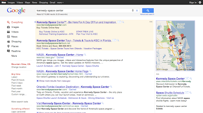
On the results page, you’ll notice a new gray bar and a blue search button to highlight the search box at the top of the page.
A few other design changes to help you focus finding what you’re searching for include:
- An updated design for the left-hand panel of tools, where we’ve muted the color of the tools and reserved the use of bolder colors to highlight key action buttons, tools and filters.
- The URL relocated directly beneath the headline for each search result.
- Links on the homepage moved to the top and bottom edges of your browser, making the notably clean Google homepage even cleaner.
» Some updates to the design of search | Inside Search

No comments:
Post a Comment
Do provide your constructive comment. I appreciate that.